The Anatomy of a Well-Designed Card
Ever picked up a card, turned it over in your hands, and thought “that’s just spot on” — without quite knowing why? That’s the quiet magic of clever design. A well-made card doesn’t shout for attention, it simply feels right. Here’s what usually goes into making one.
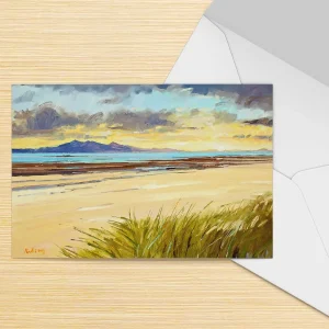
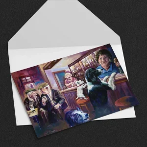
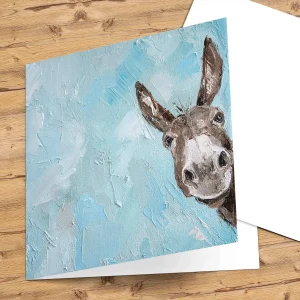
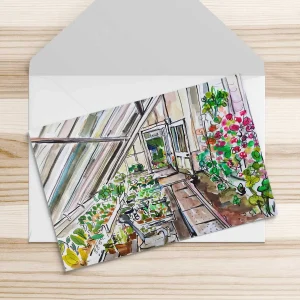
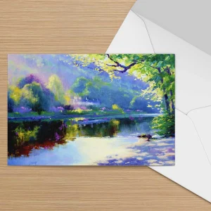
Artwork that fits the feeling
Whether it’s a serene Scottish landscape or a bold splash of humour, the illustration or photo sets the tone instantly. Good cards don’t just look pretty; they match the sentiment. A card for sympathy won’t be garish, just as a birthday laugh shouldn’t be drab.

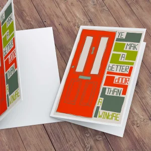
Typography that talks properly
You might not consciously notice the font, but you’d spot if it was wrong. A swirling script suits weddings, a chunky playful type suits a daft joke. Size matters too — nobody wants to squint to read your heartfelt words.
Quality that’s felt, not told
Texture, weight, finish — these are small details that tell your hand (and your eye) this is something a bit special. Thick, matte papers often feel more luxurious, while a glossy card might make colours pop. A well-designed card considers how it feels as much as how it looks.

Space for your words
Designers worth their salt leave enough breathing room for you to add your own message. A cluttered card can be intimidating to write in. Simplicity often wins here.
Curious about why greeting cards still work their quiet magic? Have a look at our Greeting Cards Hub for more stories, tips and inspiration.
Curious about why greeting cards still work their quiet magic? Have a look at our Greeting Cards Hub for more stories, tips and inspiration.